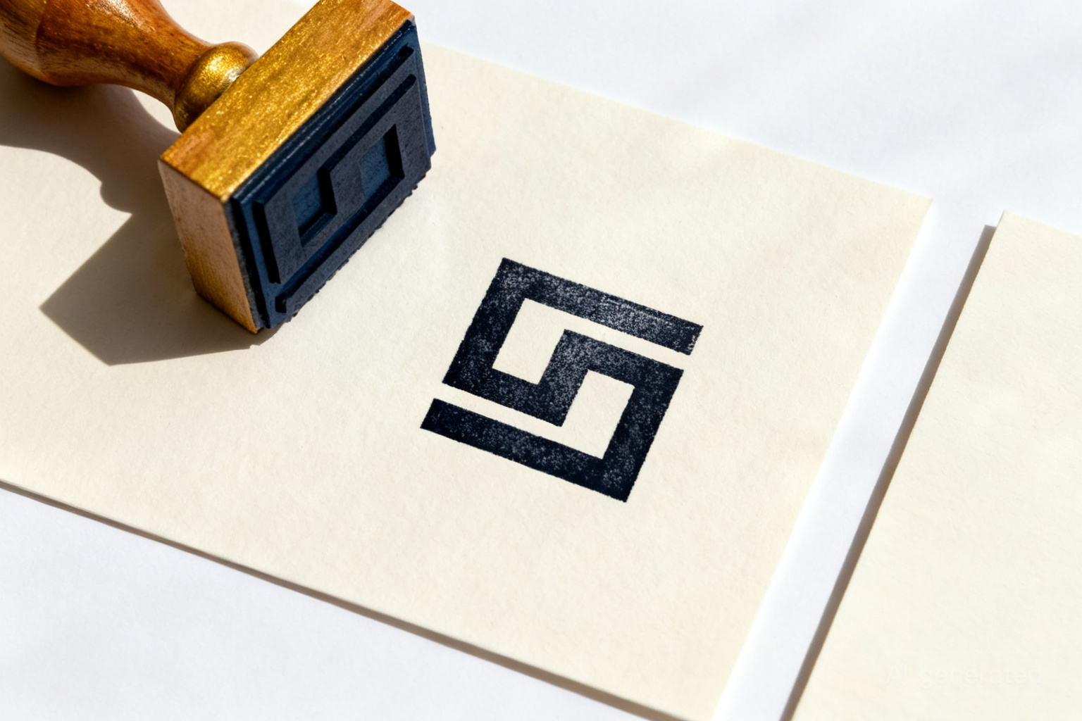
A well-designed custom rubber stamp does more than mark a document—it reinforces your brand identity and builds trust with every impression. But a poorly designed stamp can smudge, blur, or look amateurish, undoing the professionalism you've worked to establish.
This guide walks you through the concrete decisions that separate effective stamp designs from forgettable ones. Whether you're stamping invoices, sealing envelopes, or marking inventory, these principles apply to Cypress, Houston, and beyond.
Key Takeaways
- Start with clarity: fine details that look sharp on screen often disappear when stamped onto paper.
- Choose line weight and font size based on your stamp's actual dimensions, not your design file.
- Single-color stamps offer reliability and cost-efficiency; color stamps require careful ink selection and substrate testing.
- Test your design on the materials you'll actually stamp before committing to a full order.
- Align your stamp design with your broader brand system—logos, fonts, and colors should echo across all touchpoints.
- Avoid overcrowding; white space and breathing room make stamps more readable and more professional.
What Makes a Rubber Stamp Design Actually Work?
A functional stamp design balances visual impact with practical printability. The core principle: if it can't be stamped clearly and consistently onto your actual materials, it isn't ready yet.
Effective stamps have strong contrast between the raised image and the surrounding space. They use clean lines, adequate spacing, and a hierarchy that guides the eye to the most important element—usually your logo or business name. Avoid thin, delicate lines or tiny details that rely on perfect ink saturation to be legible.
Think about your stamp's job: Is it marking confidentiality on documents? Authenticating a product? Confirming receipt of payment? The design should reinforce that function. A law office's stamp might emphasize formality and trust; a maker's mark might emphasize craft and uniqueness.
Test your design mockup by printing it at actual size and holding it at arm's length. If you can't read it from three feet away, it won't work as a stamp.
How Do You Choose the Right Size and Shape for Your Stamp?
Stamp size and shape determine both usability and design complexity. A 1-inch round stamp demands simplicity; a 3-inch rectangular stamp can accommodate more detail and text.
Start with your primary use case. If you're stamping small envelopes or invoices, a 1.5-inch to 2-inch stamp works well and fits naturally into document corners. If you're marking large boxes or shipping labels, a 2.5-inch to 3-inch stamp gives you room to breathe and makes the mark more visible.
Rectangular stamps suit horizontal text and logos; circular stamps work well for badges, seals, or centered marks; oval stamps offer a middle ground. Custom shapes are possible but add complexity—stick to standard shapes unless your brand identity truly demands otherwise.
Shape also affects how people hold and use the stamp. A circular handle is intuitive; a rectangular base gives stability on a flat surface. Consider whether your users will be stamping while standing, sitting, or in a rush.
Measure the actual space where your stamp will land. If you're stamping invoice corners, a 1.5-inch stamp fits better than a 2.5-inch. Practical fit beats aesthetic ambition.
What Font and Line Weight Choices Matter Most?
Typography makes or breaks stamp legibility. Sans-serif fonts (like Helvetica or Arial) are more readable at small sizes than serif fonts, which can fill in or blur. Bold or semi-bold weights hold up better under the pressure and ink variation of stamping than thin or light weights.
Avoid script fonts, handwriting fonts, or anything with delicate flourishes. They look beautiful in a design file but often lose definition when stamped. The same applies to very small point sizes: 8pt text might be readable on screen but illegible when stamped onto textured paper.
Letter spacing matters too. Cramped text becomes a muddy blur; generous spacing keeps each letter distinct. Aim for at least 10–15% extra space between letters compared to what looks natural on screen.
If your stamp includes both a logo and text, ensure the text is large enough to stand alone. Don't rely on the logo to carry the meaning—the text should be immediately clear.
Choose one font family and use it consistently across your stamp, your business cards, and your other branded materials. This repetition strengthens brand recognition.
Should Your Stamp Design Include Color, or Stick to Single-Color Ink?
Single-color stamps (typically black or dark blue) are the industry standard because they're reliable, affordable, and work on nearly every paper type. They also reproduce consistently across thousands of impressions.
Multi-color stamps are possible but introduce variables: different ink colors require separate registration (alignment), and some inks dry or set differently on different substrates. If you're stamping on glossy, coated, or absorbent papers, color choice and ink formulation become critical.
For most small businesses in the Houston area, single-color stamping is the practical choice. It's fast, predictable, and professional. If you do want color, work closely with your printer to test on the exact papers you'll be using—glossy business cards stamp differently than kraft envelopes or cardboard boxes.
Consider also how your stamp color integrates with your broader brand. If your brand uses a specific Pantone color, that's worth investing in; if you're stamping a generic mark, black or dark blue is timeless.
If you're sealing presentation folders or other premium materials, a single-color stamp in a brand-appropriate ink color often looks more sophisticated than multi-color.
How Can You Test Your Stamp Design Before Ordering?
Never order a full production run without testing. A mockup or sample catches design flaws that a digital preview misses—ink saturation, line clarity, color accuracy, and how the stamp actually feels in hand.
Ask your printer for a sample or proof of your stamp design. Most shops, including 53Printers, can produce a test stamp so you can see how it performs on your actual materials. Stamp it onto the papers, envelopes, or boxes you'll be using in production. Look for smudging, ink bleeding, incomplete impressions, or lines that blur together.
During testing, also check the pressure and ink saturation. A stamp that requires too much pressure to produce a clear mark will fatigue your hand and slow your workflow. One that requires too little might over-ink and blur. The sweet spot is a firm, even pressure that produces a clean mark without forcing.
If you're stamping onto multiple substrate types (cardboard, glossy paper, kraft, etc.), test on all of them. Ink behaves differently on each, and a design that works on one might not on another.
Keep your test stamp and use it as a reference during production. If the final stamps don't match the test quality, ask your printer to investigate before you accept the full order.
What Common Stamp Design Mistakes Should You Avoid?
The most frequent mistake is overcrowding. Designers try to fit too much information—a logo, business name, address, phone number, website, and tagline—into a small space. The result is a stamp that's illegible and looks cluttered.
Another common error is using line weights that are too thin. A 0.5pt line looks fine on screen at 100% zoom, but when stamped at actual size, it often breaks apart or disappears. Aim for minimum line weights of 1pt to 1.5pt, depending on your stamp's size.
Relying on color to distinguish elements is risky. If your stamp uses blue text on a light blue background, it might be unreadable when stamped with black ink. Ensure contrast exists regardless of ink color.
Forgetting to account for ink bleed is another pitfall. Ink naturally spreads slightly when stamped, especially on absorbent papers. Leave a small buffer of white space around important details so they don't blur together.
Finally, designing in isolation instead of checking alignment with your broader brand. Your stamp should echo the fonts, colors, and design language of your business cards, flyers, and website. Misalignment undermines your professional image.
Ask someone unfamiliar with your business to look at your stamp design and tell you what they see. If they struggle to read it or understand its purpose, redesign before ordering.
How Do You Integrate Your Stamp Into a Larger Brand System?
Your stamp is one piece of a larger visual identity. If your logo, fonts, and color palette aren't consistent across your stamp, cards, flyers, and signage, your brand feels fragmented and unprofessional.
Start by defining your brand system: your primary logo, secondary mark (if any), approved fonts, color palette, and spacing guidelines. Your stamp design should draw from this system, not contradict it. If your brand uses a specific sans-serif font, use it in your stamp. If your brand color is forest green, consider incorporating it.
A stamp's design language should also match the formality and personality of your brand. A corporate law firm's stamp looks different from a craft studio's stamp, which looks different from a tech startup's mark. Your design choices—serif vs. sans-serif, minimal vs. detailed, monochrome vs. color—should reinforce your brand identity.
If you're starting from scratch or refining your brand, consider working with a designer who understands how print and digital touchpoints work together. Our graphic design services can help you build a cohesive brand system that includes stamp design, logo refinement, and guidance for all your printed materials.
Create a simple one-page brand guide that shows your logo, approved fonts, colors, and how your stamp fits into the system. Share it with your printer so they understand your vision.
Can You Use the Same Design Across Multiple Stamp Products?
Yes, with thoughtful adaptation. The same core design can work on a 1.5-inch round stamp, a 2-inch rectangular stamp, and even a larger format—but each size requires tweaking to maintain legibility and balance.
A circular version of your logo might work perfectly on a round stamp but look awkward on a rectangular one. Text that fits neatly in a 2-inch square might need to be resized or repositioned for a 1.5-inch circle. Work with your designer or printer to adapt, not just shrink, your design for each format.
You can also apply the same stamp design to complementary products. If your stamp marks documents, that same design might work on appointment cards or loyalty cards to reinforce brand consistency. Just ensure the design is legible at each size and on each material.
Consistency across formats strengthens brand recognition. When customers see your mark on an envelope, a document, and a card, they remember you.
If you're ordering multiple stamp sizes or formats, ask your printer to provide digital files showing how the design scales and adapts. This prevents surprises and ensures professional results across all versions.
What Design File Format and Specifications Do You Need to Provide?
Your printer will need a high-resolution, vector-based design file—typically Adobe Illustrator (.ai) or PDF. Vector files scale cleanly to any size without losing quality, which is essential for stamp design.
Provide your design at actual stamp size (or larger, clearly labeled). If your stamp is 2 inches wide, design it at 2 inches in your file. This prevents miscommunication about scale and ensures your printer can evaluate line weights and spacing accurately.
Use 100% black (or your specified ink color) for all stamp elements. Avoid gradients, drop shadows, or effects that don't translate well to stamping. Keep the design simple and high-contrast.
Include a brief design brief with your file: the stamp's intended use, the materials you'll be stamping, and any special requirements. This helps your printer anticipate potential issues and suggest solutions.
Before submitting your design, zoom to 100% in your design software and check that every line, letter, and detail is crisp and clear. What looks good at 50% zoom might fall apart at actual size.
Frequently Asked Questions
Why does my stamp design look good on screen but blurry when stamped?+
Screen resolution and print resolution are different. A design that looks sharp at 72 DPI on your monitor may have thin lines or small details that don't hold up under the pressure and ink variation of actual stamping. Test on physical materials before ordering, and use line weights of at least 1–1.5pt. Avoid tiny text or delicate details; if you can't read it at arm's length in your design mockup, it won't stamp clearly.
Can I use a script or handwriting font in my stamp design?+
Script fonts are risky. They look beautiful on screen but often blur or fill in when stamped, especially if they have thin strokes or delicate flourishes. For maximum legibility, stick with bold or semi-bold sans-serif fonts. If your brand identity absolutely requires a script element, work with your printer to test it on a sample stamp first.
What's the best size for a stamp if I'm just starting out?+
A 1.5-inch to 2-inch stamp is a practical starting point. It's large enough to be legible and visible, small enough to fit naturally on most documents and envelopes, and easy to handle. If you're stamping large boxes or shipping labels, you might go up to 2.5 or 3 inches. Consider where you'll actually use the stamp before deciding on size.
Should I include my full address and phone number on my stamp?+
Only if your stamp is large enough (2.5 inches or more) and your design can accommodate the text without becoming cramped. For smaller stamps, focus on your logo and business name. If you need to include contact details, ensure the font size is at least 8–10pt and the text has plenty of breathing room. Overcrowded stamps look unprofessional and are harder to read.
How do I make sure my stamp design matches my business cards and other printed materials?+
Use the same fonts, colors, and logo across all your printed materials. If your business cards use a specific sans-serif font and your brand color, your stamp should too. This consistency reinforces brand recognition. If you're designing multiple items, work with a designer who can create a cohesive brand system and ensure every piece—from stamps to cards to flyers—aligns visually.
Can I order a small test batch of stamps before committing to a full production run?+
Yes. Most printers offer sample or proof stamps so you can test the design on your actual materials before ordering in volume. This is a smart investment—it catches design flaws, confirms ink color and saturation, and ensures the stamp works reliably in your daily workflow. Always test before ordering your full quantity.
What's the difference between a rubber stamp and a self-inking stamp?+
A traditional rubber stamp requires a separate ink pad; you press the stamp into the pad, then onto the paper. A self-inking stamp has a built-in ink reservoir and re-inks automatically after each impression. Self-inking stamps are faster for high-volume use but require more maintenance. Both work well for most small businesses; your choice depends on your workflow and volume.
Is single-color stamping really enough, or should I invest in a multi-color stamp?+
Single-color stamping is reliable, affordable, and works on nearly every paper type. Multi-color stamps introduce complexity—different inks, registration challenges, and substrate compatibility issues. For most small businesses, single-color is the practical choice. If your brand identity truly demands color, test thoroughly on your actual materials before committing to a full order.
Ready to Design Your Custom Rubber Stamp?
Let our team help you create a stamp that reflects your brand and works reliably every day. We'll guide you through design decisions, provide samples for testing, and ensure your final product is professional and functional.
Get a Free Quote